Monday, November 28, 2011

Final projects

It's that time of the semester: students are working on their final projects. We've got approximately 15 students working on full-page graphics and interactive graphics. It's been an interesting experience as we work on finding the best way to communicate expectations with students without taking away time from our guest lecturers.

I'm really excited to see what I learn from each of the projects, which range from things about cameras and video cameras to hot air balloons. We're going to see graphics on hunter safety and coffee shops.

It's inspiring me to think about making one of these over intersession. Thoughts on possible topics?

Sunday, September 18, 2011

Something to make you laugh

One of my favorite blogs to follow is You look like the right type. Mark Addison Smith rights down dialogue he hears around him, sketches out something incorporating the dialogue, then posts a sketch every 24 hours. It's a great way to realize how what's going on around us can provide inspiration for what we do as journalists and designers.

Here's yesterday's sketch:

Friday, September 9, 2011

Critique: Tigers and Cupcakes

In this week's Tiger Kick-off, we're running a story about how MU football coach likes to play teams that are considered pretty easy to beat, aka cupcake teams. The original idea for lead art was a lot of stats over a cupcake (the reporter came up with this idea). What this morphed into was the idea of illustrating a Tiger eating a cupcake. That's where I came in.

Here's the second version of what I came up with:

The manager of Tiger Kick-off and I had some concerns about the illustration being too adorable for what we were going for. As a result, I replaced the cupcake with stock art of a real cupcake, and stacked the cupcakes behind the tiger.
Personally, I'm in love with it. But I adore cupcakes and got to play with a stuffed tiger hand puppet that roared for a day, so I'm kind of biased.


Sunday, July 17, 2011

Critique: How antibiotics work


We're working on a pediatric health section at work, and one of the topics is acne. Many times, a dermatologist will prescribe an antibiotic to treat acne, so I was curious as to how antibiotics work. As a result, I made these two graphics for fun. I'll also be creating a visual.ly account and posting them there, just to see how the service works.

Wednesday, May 4, 2011

You Can't Miss: A Rant Against Apple and Typography

This week's only post from Made by Many was a rant against Apple. Paul Sims started out by doing a search on Instragram and Apple to discover people's thoughts on an Apple buy-out of the company. It goes on to discuss the secrecy behind Apple, they're total control over anything that goes out over their services and the company's failure at anything social. He goes on to point out that Instagram is actually marketing Apple products because people want iPhones for the app. He has an interesting take on the separation of products for Apple and Android.


And as some brain candy for our last week of class, I'm sharing a blog, youlookliketherighttype, that publishes an overheard phrase in custom typography pretty much everyday. Add it to your reading list; it's so worth it.

Critique: Final cover design

I had the idea for the cover last week, with the red background and funky type, I promise. I realize that it bears a resemblance to the New York Time's Magazine cover out now. Of course, if the NYT is doing it, maybe that means it's pretty cool and striking.

I'm also working on a second cover with the blueprint feel, but it's not as strong as this one, and personally, I think the typography is pretty cool.

Response: The semester

I can honestly say that this is one of the hardest semesters I've encountered in college, which is probably the way it's supposed to be, considering the grad school thing. But I think I've also learned a lot, and certainly worked on more things with so many different styles.

Designing for Vox was an interesting experience which was valuable in its own way for helping us get experience of designing for a magazine. The prototypes were a lot of fun, and I know that Cupboard came so, so far from the beginning. I think that was probably the best part of the semester, seeing how revisions can make something great, as well as how important it is to have the pieces before you start designing.

I also really appreciated the emphasis on our portfolio, mini-portfolio and websites. I think that will help us as we go out into the real world, and even for those of us who aren't going there quite yet, it's a good start for when we do.

Wednesday, April 27, 2011

Critique: Mini-portfolio


I've been spending some time on my mini-portfolio this week, and this is what I've come up with for the cover.

A friend of mine told me to think of it like a cover letter, so I thought I'd use it to lead into the fact that I bake a lot and don't mind sharing with the newsroom. It also can serve as symbols for the two different things that are going into my mini-portfolio: the infographics and the design work I've done.

I don't particularly care for the illustration of the cake because I think it looks like a toilet paper roll, and the cookie doesn't really fit. So I think I'm going to repeat the images of the cupcake and the pie.

Response: iPad design

It was a lot of fun seeing what other's had designed for the iPad. One thing I noticed throughout was the sort of formatted designs that Mag+ has kind of forced us into. It's all about finding photos that it's okay to put text over and forcing the text to one side.

I also think that it works better for certain types of publications that use photos and illustrations that you can do with this. It also shows that there needs to be emphasis on the extras you can throw into the iPad app, which isn't something we really have time for. But it's been fun to learn, and I'm planning on figuring out some of the different things I can do with it over the summer.

You Can't Miss: Illographics and Funny Overheards


There was a cool example of an illographic posted at Charles Apple's blog the other day. I like how they were able to liven up a fever chart for a story that could be easily passed over for it's kind of boring nature. If you read down in the blog post, it says that this graphic, which is from the Omaha World-Herald, was originally slated for the Business front, but I'm happy it ended up on the front page.

At Made By Many, they decided to post some Overheard at Made By Many, and it's kind of fun to look at as the semester wraps up and I'm going a little bananas.

Wednesday, April 20, 2011

Critique: Feature Design


I designed this week's feature, which was originally Faces of the Force. It changed a lot from the draft I turned in Sunday and what's being published, but overall I'm pretty happy about it. I like what I was able to do with the photos, which gave the cover designers a lot of problems. I think I was able to make them less criminal looking, at the very least.

Response: SSND judging

It was a lot of fun being at SSND judging all day on Monday. It was interesting to see what the judges thought about all of the work that was submitted. The thing that I found most interesting was that they wanted a little more text on photo pages. They wanted more than a headline and photo captions. They wanted some poetry to remind people about how cool the event so that it became more of keepsake piece that people could look at years from now and still remember being there.


You Can't Miss: Videos about design and things to never say to a designer

This week on Made by Many, they posted three videos about various types of design, including t-shirt design. My favorite was on data visualization. The last video is pretty important for any of us looking to freelance because it's on working with clients and making sure you get paid.

And on that note, Ron Reason, a newspaper design consultant, posted this list on things to never say to a designer or art director. I think my favorite is probably the second, "This story is 74 inches long and there's only a mug shot."

Wednesday, April 13, 2011

Critique: Does this look like a lightbulb?

This was my cover for 30 under 30, and I kind of like it. However, when newsroom people saw it, it took them a while to realize that it's a lightbulb. That confuses me, because it seems obvious to me, but I'm clearly biased. So, I'm taking a poll. Does this look like a lightbulb to anyone else?

Response: Mini-portfolios

It was great to see all of the different ways to design mini-portfolios. I liked the different ways to section them off, integrate contact information and resumes, design multipage spreads into the portfolio and the different sizes.

One of the big comments was that Erica's second portfolio was too big. I actually had a conversation with her about it later, and the reason she did it that way was because she had given the small one to a potential employer, and he couldn't read it. I think we're assuming that the people seeing this will be able to read things as well as we do. But, they're also likely to be older and unable to see them, so that's something important to think about.

Tuesday, April 12, 2011

You Can't Miss: Web design and Google Fusion Tables

This week on Made by Many, there's an interview with Daniel Howells, a British web designer. One thing that I especially like is that he leans toward, simple, well-designed, grid-based website designs, which is what I feel like we'll be making. You can see some of the work his design firm has done for the magazine Dazed Digital. The design is kind of unusual because so much is on the homepage; the navigation isn't that important. I'm not sure how I feel about it, but it's always good to look at something different.

And for Tuesday night's kind of crazy learning experiment, I teamed up with Pat Sweet to create a graphic that showed how many kids live in each census block in the Columbia Public School District using Google Fusion Tables. It's very similar to what Flash could do, but we didn't have to handcode all 5,000+ census blocks.


The hardest part was getting the data file small enough that we could use it. I think we spent a few hours testing different methods of getting the shape of the school district, which is actually about a third of Boone County. There are certainly things I wish I could change, and I have a feeling Google will fix some of these in the future. For example, I wish you could just roll over the school districts to see how many kids live there instead of clicking. But I'm also glad I didn't have to spend hours coding. For some great instructions on using Fusion Tables, go to John Keefe's blog.

Tuesday, April 5, 2011

Critique: Spring Break photos and logo


For some odd reason, I can only post these two images. However, above is a peach dump cake, which is absolutely delicious despite how it looks and sounds. It's called dump cake because you dump in two cans of pie filling, a package of yellow cake mix and a stick of butter. Heat at 350 in the oven until bubbling. It's delicious. And also inspiration for anytime I'm just stuck.

This is my logo. It's a collection of Ninth St. signage. The S is from a stop sign, A from a movie poster in my living room (on Ninth St.), R from Starbucks, A from Kaldi's and H from Which wich. Surprisingly (to me anyway), H was the hardest to find. I really enjoyed this assignment because I had to actually think about which signs would work with the letters together. There was certain typography that's cool, but would not have worked with anything else, such as Shakespeare's.

Response: Assignments


It was great to learn that we'll be using Mag+ for an assignment instead of trends. Although I think it's a great assignment, it's nice to have the extra breathing space and learn a useful skill. I also think it'll give us a better chance to dig into everything Mag+ can do.

It was a lot of fun hearing about everyone's Spring Breaks as well. It was great to hear how the photo assignment kind of affected everyone's breaks, making them think about inspirational things that they might have passed by before. I know I was thinking about my drive back to Columbia a lot more because I knew I wanted to take photos then.

You Can't Miss: Start-ups and the infographics editor of National Geographic

In this week's Made by Many blog post, Justin McMurray discusses the thought process behind lean start-ups. Although none of us are working on project management, one of the things that really struck me about this post was the emphasis on talking to people who aren't objective. They talked about taking to friends of friends instead of friends. Walking the street instead of emailing your mom. I think this is great advice for anyone, not just startups.

And on another advice-giving blog-post, Juan Velasco, the graphics editor at National Geographic, gave an interview to newspaperdesign.ning.com. His advice to visual journalists is to make sure you're reading the paper everyday so that you can converse about what's going on with other editors. If you can smell a visual story and suggest it, you'll have a lot more respect than if you just wait for assignments.

I also appreciated his description of the information graphics reporting process: "Graphics are journalism, and the process is the same used by a writer or a photographer in a newspaper: first, gather all the information you need by doing research (in the field, online, with phone interviews), etc. Then, you need to be able to select the most relevant information and sketch out a visual narrative that is clear and engaging." Sometimes I think that people forget that visual journalists are still journalists, we just tell a story a different way.

Wednesday, March 23, 2011

Critique: a graphic

I feel like I should be critiquing my first round of Cupboard designs, but all of the content is changing so much that I don't think it's worth it. They're adding a person, we're shooting photos and adding a lot of sidebars. So, instead, I offer a full-page graphic I'm working on for a special section for the Missourian.

It's basically a bunch of stats gleaned from the Census that people expect and should know about, but the editors didn't want to write a story about. I turned it into this idea of getting to know the type of people that make up Columbia. We are (mostly) young, female, single and possess a Bachelor's degree.

I'll be playing around with the colors so more to get a better feeling of dominance. I don't think I have enough room to really play around with graph sizes or more design features, so I'm going to have to use color, but I think it's a good start.

Response: Prototypes

It was a lot of fun seeing everyone's prototypes this week in class, and I'm excited to see where everyone will take there's when we're done.

Shindig: This magazine seems like it's a lot of fun to work on. I really like the sleek and slightly retro, but still contemporary, look to it. It seems very polished and the closest to complete. Some of it felt a little decorative to me, but I really enjoyed looking at the spreads.

Nosh: I like the concept for this magazine, though I'm definitely the type of person who eats three meals a day. Theresa's got a great start to everything, and all of the other designers will do really well.

Plaid Dad: I loved the steel strip going down the side. It's a nice "manly" feature to through it, and I didn't even notice it at first. It fit so well with the magazine that I glanced over it, but it added to the masculine feel of the magazine.

Modern Midwest: I think they're facing a big challenge in the lack of place-type photos in Meredith's library, but I think they'll overcome it. I like the younger feel they have going with the magazine and can't wait to see what it looks like.

You Can't Miss: Color for the color-blind and favorite mobile apps


A friend of mine emailed this site to me the other day: colorbrewer. It's a site that will give you RGB, CMYK and HEX codes for different color shades for maps, including combinations that work for those that are color-blind, as well as "print-friendly" and "photo-copy safe." It's a pretty neat website that will let you see what a segmented map will look like with different color combinations.

This week in Made by Many, there's a blog post that's a Q&A with Ivo Jansch, who started up a mobile app company. He said something that resonated with me, and I think speaks to some of what Kristin was getting at in her presentation. He talks about a iPad app called Flipboard, which turns Facebook status updates and tweets into a magazine-like reading experience.

Jansch says, "It turns your Twitter and Facebook feeds into a very visual digital magazine. It's a very pleasant reading experience. The people at Flipboard understand the tablet use case and they understand how people like to read content these days."

Kristin made the point that iPads are an opportunity to combine the best of web and print, and I think Jansch is getting at that point by selecting Flipboard as his favorite app and describing it the way he did.

Wednesday, March 16, 2011

Response: SJI logos


It was fun seeing everyone's logos this past week. This was probably the hardest design assignments I've ever done because it's so different from news design.

It was also interesting getting Greg's design advice. He takes design literally, instead of figuratively, which is very different from a lot of what we do. But I think it's also good for us to experience because it's how non-designers see design.

Critique: Food challenge covers, rd. 2


During last week's critique, I was given the option of reworking the David and Goliath cover or the fighting cover. I ended up doing both.

For the fighting cover, I think it really needs to be a photo shoot. The cut-out isn't the best, but I still love the concept. I think it's a funny concept that really deserves to be done right.

I think the David and Goliath cover is also a good concept, and it isn't as technically intricate, which is nice.

I like them both, so it'll be interesting to see what everyone else brings tomorrow and which cover the editorial team will choose.

Tuesday, March 15, 2011

You Can't Miss: Games and Graphics in Augmented Reality

I'm in the process of thinking of a game to create to go with the special section The Missourian will be putting out next month. I'm one of two people working on graphics, and there's an emphasis on interactives this year. I'm really excited about it, and I was really excited to see this post on Made by Many. It's about how we can leverage games to make them do more than what they do on Facebook.

In the post, it's more about the psychology behind games, but it'll be interesting to see how I can turn it into something useful for news. One thing that really hit home was that games need to satisfy the PERMA rule: Positive Emotions, Relationships, Meaning and Accomplishment. If anyone has an idea about how to create some of this in a quiz, I'd love to hear it.

The blog Cool Infographics showcased a graphic given in a bit of a different style: augmented reality. Hans Rosling did this for a talk that illustrated the changes in quality of life over the past 200 years. Check it out! It's so cool to see innovations like this.

Wednesday, March 9, 2011

You Can't Miss: Holler Gram and Movie Barcodes

In order to gear up for SXSW, Made by Many created an iPad app. In the blog post, they talk about how they did the animations for it, as well as distribute the code for the animations. I thought it provided great insight into the thought process behind many of the decision making we'll be doing for our iPad apps and gives us some more information about the iPad.

I also found these great movie barcodes on chartjunk. They stretched each scene out vertically and smashed each scene together.

Critique: Food challenge covers


With double production, this food challenge feature is running over Spring Break, but is being designed now. The idea is much like the Man v. Food tv show, so I wanted to find different ways to illustrate that idea.

The first one is pretty clear to get the concept, I think. My biggest problem with it right now is that I think it could also work as a cover for a story about obesity.

The second one is my favorite concept, with a man and food squaring off in the boxing ring. I'm not a fan of the typography, so if anyone has any suggestions on that, I'd appreciate it.

The third one is a man vs. the local food challenges. The story features four different food challenges around town, and I would like to photograph each of the four challenges and use them instead of the stock art I pulled.

Response: iPad conference

There was so much going on this past week, it's hard to settle on just one thing to talk about. But I think the most design-relevant event was the iPad conference. I went to the Popular Science talk and the BHG talk.

I really enjoyed the part where everyone seemed to be making it up as they goes along. The don't know what they're doing any better than we do.

I also appreciated seeing two different perspectives on getting involved. With Popular Science, they released their iPad app the same day as the iPad. BHG is timidly testing the market until things settle and there is a standard for what should be done.

Wednesday, March 2, 2011

Critique: Logos


So, I've actually spent most of my time this week tracing over a hundred years of Missouri Congressional state boundaries. It's boring, tedious work that will actually make a pretty cool interactive graphic when I'm done.

But other than that, I've been working on logos for SJI. I've posted a sampling of what I've come up with so far. My favorite is actually the blue one on the bottom because of the color and the emphasis on the more journalism-y aspect. I might add the Institute's tagline above the 'S' somewhere.

This week, I'll keep plugging away on the interactive graphic and more logos. I'm looking forward to seeing what everyone else has done.

You Can't Miss: Redesigning the health report and Google's relationship with the news


First off, this has been out for awhile, but I think it's a great example of how good design can improve the lives of everyone. In December, Wired did a piece on how redesigning medical tests can empower patients to understand what is going one with their bodies. It's an example of how great design can change someone's life for the better.

Secondly, Made By Many blogged about a bunch of different links this past week, one of which was very interesting to me. Google is partnering with the International Press Institute for a news innovation product competition. They've allocated $2.7 million to the project. It's interesting to see how many of these products are created, and how design plays a role in their success.

Response: Historical perspectives

It was fascinating to see the change in design from the 1950s to the 1960s. As Jan said, there wasn't a lot of difference in the design during the decades until then.

It was especially interesting to see the differences in Esquire. I had looked at the 1940s, but the design in that decade was a page of text, a page of image. There was actually a decent amount of difference between the '40s and '50s, but with the amount of color and more unique illustrations used in the '60s, there was an even bigger difference.

Wednesday, February 23, 2011

Response: The September Issue

I was excited when Jan said we were watching The September Issue in class the other day. I've been wanting to see it, but haven't really made the time to see it. It was an enlightening look into the creation of an issue of a magazine.

I really like seeing the interaction between Grace and Anna. I felt like Grace was always a little more creative than Anna was comfortable with and Anna was constantly bringing her back in, but that Anna really respected Grace.

My favorite spread was the color-blocking spread because of the creativity shown, especially because it was shot on the fly. I also really like how she wouldn't let them Photoshop the guy's stomach. I thought it was interesting that the only perfect bodies she wanted were from the models. I thought the managing editor's reaction when she found out about the late shoot was great.

You Can't Miss: Q&A on completing an internship and Martha Stewart on the iPad

Over on Made by Many, their intern just left, and she had a good-bye post with some great advice. I think my favorite is about the process that they use user-feedback in creating their products. She says, "After six months at MxM I believe that their greatest successes come from their ability to build the thing quickly, get extremely valuable feedback from users and iterate upon it often. Feedback is used to inform future iterations. It's not about failing early, but rather about integrating learning as part of the process."

That's one thing I like about this class and that I'll miss out in the real world: the feedback that we get from everyone, so that we can integrate it into our designs.


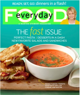
At the Garcia Media blog, Mario Garcia talks about how Martha Stewart's food magazine, Everyday Food, is now on the iPad. For those of us designing food magazines for the prototype, it's a great place to start. I don't have an iPad, so I can't test it, but it apparently includes how-to videos, recipes and all sorts of other fun features.

Critique: Prototype Covers


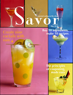
Really nailing down a personality helps tremendously when you're trying to design something from scratch. At least, that's what I decided after coming up with a new cover for the frugal foodie magazine cover.

We're currently in a name crisis, so I created two covers, one with each name. I wanted something a little retro, back to a time when more people (supposedly) cooked. And I didn't want it to be perfect looking because cooking is messy and it's impossible to be perfect when cooking.

I don't know if the sell lines work as well as I would like; they seem to get kind of lost in all the color. But other than that, I like it.

Wednesday, February 16, 2011

Response: Prototype critique


I liked hearing what people thought of my designs in class. It gave me a lot to think about, especially with the cover and logo.

Even beyond the fact that this isn't a magazine cover (and it wasn't really intended to be at the time), after seeing the cover with the rest of the designs I did, it felt really off. I think it was good to see it up on a screen, and see what other people had done to get a better feel for where I need to go.

Critique: Cupboard Department Page


After being critiqued during class yesterday, I decided to work on my department page first, mainly because I felt as if it needed the least amount of work. I completely reworked the ingredients portion so that it would take up less space, but people could still see what the food looked like.

I'm still not done with it, clearly, but I wanted to get some thoughts. Right now, the ingredients aren't taking up a full page. I'd like to re-arrange the food so that it takes up the entire page, mostly by making the ingredients taking up different amounts of space while still following a basic grid structure. Thoughts?

This is the big design project I'll be working on for quite some time.

Tuesday, February 15, 2011

You Can't Miss: Q&As


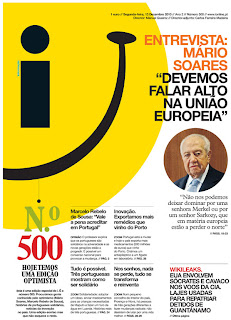
The Society for News Design recently announced their annual award for the best designed newspaper: i. It's a small paper in Lisbon, Portugal that looks a lot like a magazine. And according to the paper's former art director's Q&A with Charles Apple, that's at least partially because they use hot-press printing, like many magazines.

What I really loved from his Q&A was his advice to make newspapers better in the U.S. is to "just do it!" His point was that newspapers are a very temporary medium; often they just line the bird cages when people are done. So trying that new thing is really easy because people don't really remember when the screw-ups happen. I think this is important for us to remember as we're designing our prototypes because we're trying to do something the company has never done before.

In MadeByMany's Q&A with Darryl Ohrt, he emphasized the energy brought to his agency by re-branding. It's an interesting thought that something so time consuming and hard can also bring energy to an agency. But if you think about it, it makes sense. I always feel far more energized working on something compared to sitting in a class.

Wednesday, February 9, 2011

Response: The History of Magazine Design

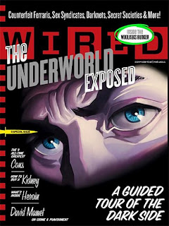
This Wired cover for the Feb. 2011 issue exemplifies a lot of same design treatments that T.M. Cleland gave Fortune. For starters, it's printed on a very similar paper type. But beyond that, it's a conceptual illustration, much like many of Fortune's covers.

Owen's said, "The magazine (Fortune) was a great gamble, very much a 'conceptual' product which flew in the face of conventional wisdom."

Wired is also a very conceptual product, which uses different illustrations to get the point across, instead of relying on photos.

Critique: Smoking Cover


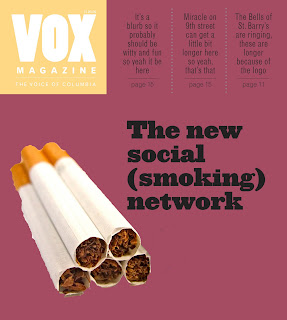
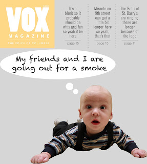
Most of my design time has been spent on designing a cover for the social smoking story. Last week, my baby design was chosen, but they wanted a photo from the shoot. I basically rebuilt the entire cover, and I like the new one better.

I will say that the blue is much brighter here than it is in InDesign. One of the things I was having lots of problems with was finding a color for the title and dek to be legible across the entire page. Whatever I tried always seemed to get lost somewhere on the page. So, I gave it a tiny drop-shadow to help with legibility. I think it also adds some drama.

I chose the blue and green because I think of them as colors associated with younger people, who are the ones participating in this trend. I like the photo because it shows how social smoking works. It's people lighting up after a beer. They don't buy the cigarettes themselves; they bum them off other people.

You Can't Miss: Similarities between web and print

By following Made By Many for a month now, it's really hit home how similar the goals are for web, print, apps, etc.

For example, in this post about designing apps that become integrated into people's lives, Simon L'Anson writes "I feel that for an app to really succeed it needs to become embedded in the user's daily behaviour."

Isn't that also what we want our print product and our website and our iPad product to do? It comes down to the different ways to have that work on different platforms. Whether it's by subtly reminding people to text a response at a convenient time or providing a design that people just can't miss, it's about integrating the experience into the daily experience.

It's also about content. L'Anson uses the example of an app he uses to track all of this information when he bikes on his phone as an example of a great app. He loves it. I would find it useless. But it points to needing great content that people can interact with.

In a Folio article on re-designing websites, Jonathon Hills debunks the idea that a re-design will solve all problems. In fact, it's the content that often needs the re-design more than the design. He compares a re-design to hydrogen peroxide, which makes people feel like they're doing something, when really they aren't. He applies it specifically to websites, but I think it's something to remember even with print and apps as well.

I think a re-design should encompass what's changed in the product that people now find useful that they didn't have or have use for before. But it shouldn't happen just for the sake of change.

Wednesday, February 2, 2011

Critique: Covers


I've spent a lot of time working on social smoking covers this week, and frankly I'm far more excited about them than my spring preview designs. One of the challenges for the story is that it's not the most developed story at this point. The version of the story I read was looking for more human sources, scenes and the reason that kids smoke socially.

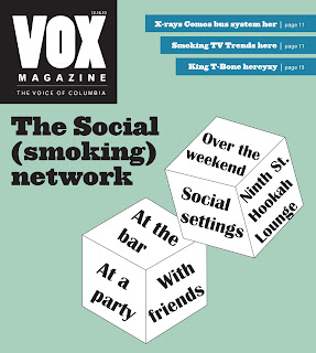
I think my favorite is the dice cover. I googled social smoking and scrolled down far enough to find a dice game for smoking. So, I recreated the dice and put on words that went with the story. However, it's missing the human element that Rhonda kept talking about last week.

When I was googling, I also found an old Marlboro ad that was a baby telling his parents to smoke before chastising him. I liked the idea of the ad, found a stock art image of a baby, cut the baby out and put different words about the child. It has the human element, but I'm not sure that it matches the story.

One of the suggested headlines was "The new social (smoking) network." I took that idea and cut-out some cigarettes to pair with that headline to illustrate that idea.

Response: The Reading

As I was going through the reading this week, I found myself thinking about which magazines did what the author was talking about on a regular basis. For example, there's a note in my reading next to the section on photo montages that just says "Vanity Fair." The section that talks about full-page photos has a note that says, "ESPN, SI."

I thought it was a lot of fun to see the historical roots of much of design work we do now.

You Can't Miss: Social Networking Fatigue and Designer Desktops

In a Made By Many's blog post this week, Cath Richardson talks about how she often feels obligated to keep up with certain apps after a period of time. It's definitely a feeling I've had from time to time with Twitter. One of the things I like about print products is that there are no alarms or obligation telling us that we have to read this or that story. We can just turn the page and move on to something that interests us.
At Design Milk, they posted the February Designer Desktop.


I think it's a good reminder when designing. It's a reminder to not go overboard with gimmicks, but to not undersell something either.

Wednesday, January 26, 2011

Response: Meredith Corporation

After visiting with the four Meredith employees earlier this week, I'm really excited to work on the publishing project with the other class. I think it'll be a lot of fun to incorporate some of the Meredith principles, such as the excellent photography, with some younger designs in magazines. I think it'll be fun and interesting to find ways to update some of their ideas.

It was really great to get the perspective on the differences between class and job as well. It was interesting to hear about how turning in a design on the job doesn't mean that you're done and some of the other challenges faced in a design job that don't necessarily exist in a class environment.

Critique: Baby Beauty Pagent

I worked on the Baby Beauty Pageant competition this week.

Based on the tone of the photos and the text, I didn't want to try anything crazy or that could seem as if it were making fun of the sources. The story was respectful of the people involved and didn't have any of the poking fun aspect that's part of Toddler's and Tiaras.

I've also been working as a designer for Global Journalist, which has a more conservative design style than Vox, and I think I had a hard time adjusting to that.


As I was designing, I felt a little as if were still designing for Global Journalist. I tried to be a little more risky, but I'm not sure I succeeded.

I also wanted to play up the father because he's such a huge part of the story.


Another struggle was the cover. It's been quite some time since I designed one and I was running out of creativity for a cover. I like the idea of this cover, but I would have preferred something a little more focused on the Dad and child.


I'll be focusing on the spring preview for the next couple of days. I'm also hoping to do a couple of fun posters, but we'll see about how much time I have left.

You Can't Miss: National Geographic, Internet Sites


From National Geographic: an interactive map of last names around the country.
It was fun to click around and try and figure out where the most Morris' live in the U.S. However, I had a hard time reading many of the names, mostly because of the transparency on the text. This was especially hard with blue, which is the color Mina Liu and Oliver Uberti decided to use for England. It seems that most American's last names come from England, so it's a consistent problem. I also wish that you could search a last name and find an area. It would be cool to search "Morris" and find everywhere with an overwhelming population, instead of searching throughout the entire graphic.

On MadeByMany's blog, there was an interesting post on the worth of internet sites. The author, Tim Malbon, takes the reader through a brief history of the must-haves of website design, including micro-sites, Flash and now a connection to social media. He makes the point that without interesting content, all the video, recipes and interactivity won't make a bit of difference to the consumer. One of the commenters noted that true engagement with the consumer happens when companies interact with consumers about what they like, not the product the company is trying to sell. It serves as a reminder to design around the user, not about what's cool or to show off what we can do.

Thursday, January 20, 2011

About me

I'm Sarah Morris, a 22-year-old grad student at the Missouri School of Journalism. I'm here to learn about information graphics and magazine design. I'll be blogging about both throughout the semester.

I'm currently a designer for Vox magazine and Assistant News Editor at the Columbia Missourian. I've been the Interim Graphics Editor at the Missourian, as well as Assistant Graphics Editor, Graphics staff and reporter.