I was excited when Jan said we were watching The September Issue in class the other day. I've been wanting to see it, but haven't really made the time to see it. It was an enlightening look into the creation of an issue of a magazine.
I really like seeing the interaction between Grace and Anna. I felt like Grace was always a little more creative than Anna was comfortable with and Anna was constantly bringing her back in, but that Anna really respected Grace.
My favorite spread was the color-blocking spread because of the creativity shown, especially because it was shot on the fly. I also really like how she wouldn't let them Photoshop the guy's stomach. I thought it was interesting that the only perfect bodies she wanted were from the models. I thought the managing editor's reaction when she found out about the late shoot was great.
Wednesday, February 23, 2011
You Can't Miss: Q&A on completing an internship and Martha Stewart on the iPad
Over on Made by Many, their intern just left, and she had a good-bye post with some great advice. I think my favorite is about the process that they use user-feedback in creating their products. She says, "After six months at MxM I believe that their greatest successes come from their ability to build the thing quickly, get extremely valuable feedback from users and iterate upon it often. Feedback is used to inform future iterations. It's not about failing early, but rather about integrating learning as part of the process."
That's one thing I like about this class and that I'll miss out in the real world: the feedback that we get from everyone, so that we can integrate it into our designs.
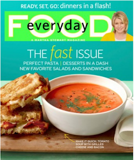
At the Garcia Media blog, Mario Garcia talks about how Martha Stewart's food magazine, Everyday Food, is now on the iPad. For those of us designing food magazines for the prototype, it's a great place to start. I don't have an iPad, so I can't test it, but it apparently includes how-to videos, recipes and all sorts of other fun features.
Critique: Prototype Covers


Really nailing down a personality helps tremendously when you're trying to design something from scratch. At least, that's what I decided after coming up with a new cover for the frugal foodie magazine cover.
We're currently in a name crisis, so I created two covers, one with each name. I wanted something a little retro, back to a time when more people (supposedly) cooked. And I didn't want it to be perfect looking because cooking is messy and it's impossible to be perfect when cooking.
I don't know if the sell lines work as well as I would like; they seem to get kind of lost in all the color. But other than that, I like it.
Wednesday, February 16, 2011
Response: Prototype critique

I liked hearing what people thought of my designs in class. It gave me a lot to think about, especially with the cover and logo.
Even beyond the fact that this isn't a magazine cover (and it wasn't really intended to be at the time), after seeing the cover with the rest of the designs I did, it felt really off. I think it was good to see it up on a screen, and see what other people had done to get a better feel for where I need to go.
Critique: Cupboard Department Page

After being critiqued during class yesterday, I decided to work on my department page first, mainly because I felt as if it needed the least amount of work. I completely reworked the ingredients portion so that it would take up less space, but people could still see what the food looked like.
I'm still not done with it, clearly, but I wanted to get some thoughts. Right now, the ingredients aren't taking up a full page. I'd like to re-arrange the food so that it takes up the entire page, mostly by making the ingredients taking up different amounts of space while still following a basic grid structure. Thoughts?
This is the big design project I'll be working on for quite some time.
Tuesday, February 15, 2011
You Can't Miss: Q&As

The Society for News Design recently announced their annual award for the best designed newspaper: i. It's a small paper in Lisbon, Portugal that looks a lot like a magazine. And according to the paper's former art director's Q&A with Charles Apple, that's at least partially because they use hot-press printing, like many magazines.
What I really loved from his Q&A was his advice to make newspapers better in the U.S. is to "just do it!" His point was that newspapers are a very temporary medium; often they just line the bird cages when people are done. So trying that new thing is really easy because people don't really remember when the screw-ups happen. I think this is important for us to remember as we're designing our prototypes because we're trying to do something the company has never done before.
In MadeByMany's Q&A with Darryl Ohrt, he emphasized the energy brought to his agency by re-branding. It's an interesting thought that something so time consuming and hard can also bring energy to an agency. But if you think about it, it makes sense. I always feel far more energized working on something compared to sitting in a class.
Wednesday, February 9, 2011
Response: The History of Magazine Design

 This Wired cover for the Feb. 2011 issue exemplifies a lot of same design treatments that T.M. Cleland gave Fortune. For starters, it's printed on a very similar paper type. But beyond that, it's a conceptual illustration, much like many of Fortune's covers.
Owen's said, "The magazine (Fortune) was a great gamble, very much a 'conceptual' product which flew in the face of conventional wisdom."
Wired is also a very conceptual product, which uses different illustrations to get the point across, instead of relying on photos.
Critique: Smoking Cover

Most of my design time has been spent on designing a cover for the social smoking story. Last week, my baby design was chosen, but they wanted a photo from the shoot. I basically rebuilt the entire cover, and I like the new one better.
I will say that the blue is much brighter here than it is in InDesign. One of the things I was having lots of problems with was finding a color for the title and dek to be legible across the entire page. Whatever I tried always seemed to get lost somewhere on the page. So, I gave it a tiny drop-shadow to help with legibility. I think it also adds some drama.
I chose the blue and green because I think of them as colors associated with younger people, who are the ones participating in this trend. I like the photo because it shows how social smoking works. It's people lighting up after a beer. They don't buy the cigarettes themselves; they bum them off other people.
You Can't Miss: Similarities between web and print
By following Made By Many for a month now, it's really hit home how similar the goals are for web, print, apps, etc.
For example, in this post about designing apps that become integrated into people's lives, Simon L'Anson writes "I feel that for an app to really succeed it needs to become embedded in the user's daily behaviour."
Isn't that also what we want our print product and our website and our iPad product to do? It comes down to the different ways to have that work on different platforms. Whether it's by subtly reminding people to text a response at a convenient time or providing a design that people just can't miss, it's about integrating the experience into the daily experience.
It's also about content. L'Anson uses the example of an app he uses to track all of this information when he bikes on his phone as an example of a great app. He loves it. I would find it useless. But it points to needing great content that people can interact with.
In a Folio article on re-designing websites, Jonathon Hills debunks the idea that a re-design will solve all problems. In fact, it's the content that often needs the re-design more than the design. He compares a re-design to hydrogen peroxide, which makes people feel like they're doing something, when really they aren't. He applies it specifically to websites, but I think it's something to remember even with print and apps as well.
I think a re-design should encompass what's changed in the product that people now find useful that they didn't have or have use for before. But it shouldn't happen just for the sake of change.
Wednesday, February 2, 2011
Critique: Covers


I've spent a lot of time working on social smoking covers this week, and frankly I'm far more excited about them than my spring preview designs. One of the challenges for the story is that it's not the most developed story at this point. The version of the story I read was looking for more human sources, scenes and the reason that kids smoke socially.
I think my favorite is the dice cover. I googled social smoking and scrolled down far enough to find a dice game for smoking. So, I recreated the dice and put on words that went with the story. However, it's missing the human element that Rhonda kept talking about last week.
When I was googling, I also found an old Marlboro ad that was a baby telling his parents to smoke before chastising him. I liked the idea of the ad, found a stock art image of a baby, cut the baby out and put different words about the child. It has the human element, but I'm not sure that it matches the story.
One of the suggested headlines was "The new social (smoking) network." I took that idea and cut-out some cigarettes to pair with that headline to illustrate that idea.
Response: The Reading
As I was going through the reading this week, I found myself thinking about which magazines did what the author was talking about on a regular basis. For example, there's a note in my reading next to the section on photo montages that just says "Vanity Fair." The section that talks about full-page photos has a note that says, "ESPN, SI."
I thought it was a lot of fun to see the historical roots of much of design work we do now.
I thought it was a lot of fun to see the historical roots of much of design work we do now.
You Can't Miss: Social Networking Fatigue and Designer Desktops
In a Made By Many's blog post this week, Cath Richardson talks about how she often feels obligated to keep up with certain apps after a period of time. It's definitely a feeling I've had from time to time with Twitter. One of the things I like about print products is that there are no alarms or obligation telling us that we have to read this or that story. We can just turn the page and move on to something that interests us.
At Design Milk, they posted the February Designer Desktop.

I think it's a good reminder when designing. It's a reminder to not go overboard with gimmicks, but to not undersell something either.
At Design Milk, they posted the February Designer Desktop.

I think it's a good reminder when designing. It's a reminder to not go overboard with gimmicks, but to not undersell something either.
Subscribe to:
Posts (Atom)