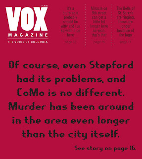
 I had the idea for the cover last week, with the red background and funky type, I promise. I realize that it bears a resemblance to the New York Time's Magazine cover out now. Of course, if the NYT is doing it, maybe that means it's pretty cool and striking.
I'm also working on a second cover with the blueprint feel, but it's not as strong as this one, and personally, I think the typography is pretty cool.
I really like your cover design. I agree that a typography and the words are striking and catches your eye. It's different than what is normally seen on a cover, so it really stands out.
ReplyDelete